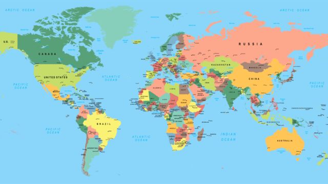
The Mercator projection has been used since 1569 and gets its name from the famous German geographer. This visual representation of what we think Earth looks like places Europe at the centre of the map while distorting the rest of the world around it. With this new projection, you’ll realise that you don’t really know the dimensions of some countries.
Discover our latest podcast
A projection that calls everything into question
This alternative projection offers the possibility to see the true size of the 5 continents. The Peters projection shows the exact dimensions of different countries in the world and doesn’t establish a central location on the map, hence creating no distortion.
The United States, Europe and Russia are a lot smaller than we could have imagined and as for South America and Africa, they are a lot bigger.
This method of looking at the world is, therefore, a lot more accurate and realistic in such a way as this is how it would be seen from space.
You should know this already
For a long time, the Mercator projection was the only projection taught in schools, but private schools in Boston were the first to start to introduce the Peters projection as the only representation of the world.
A lot of these schoolchildren were amazed by this new representation, and even if they didn’t believe it to be true at first, they quickly became used to it as the true representation of Earth.
However, if global warming were to continue, rest assured that even this map of Earth will become obsolete...
Check out the video above to see what the actual map of the world looks like!


